This website uses cookies so that we can provide you with the best user experience possible. Cookie information is stored in your browser and performs functions such as recognising you when you return to our website and helping our team to understand which sections of the website you find most interesting and useful.
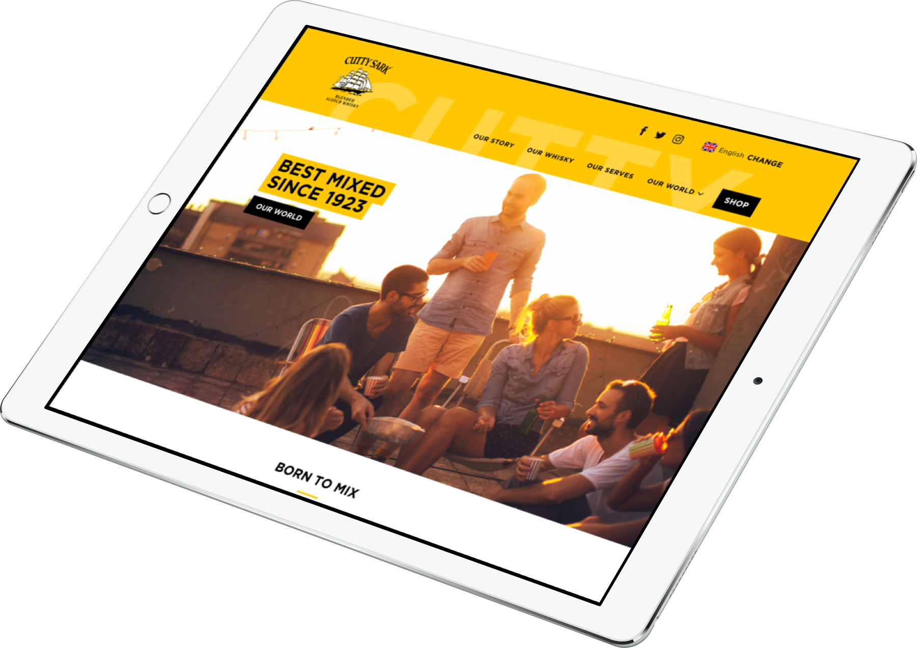
Fresh web design to attract a new kind of whisky drinker
Cutty Sark whisky is one of Edrington’s flagship brands, and the only one with an internationally-focused identity.
They needed a complete refresh of their online presence and an idea of how their new brand identity could be used on web.
The Cutty Sark brand refresh was about visually communicating a shift toward a new and competitive market, resonating with younger, more particular and image-conscious whisky drinkers. With European audiences being so crucial to Cutty Sark, the new site was designed to seamlessly accommodate the new multi-language layout, and support brand campaigns in key markets like Spain, Portugal and Italy. Edrington had employed a third party development agency to build the site, so we delivered a completed front end with assets and helped with testing, minor fixes and edits throughout development.
"The Cutty Sark site is looking great, I’m really pleased with how it is progressing and just received good feedback from management team this morning so wanted to send my thanks! Excited for it to go live now so we can start building our digital activity from a great base."
Ross, Edrington
We combine data and creativity to optimise your online presence and take your brand to new levels.


